


CNBC India's Bold New Logo: What the Rebrand Signals for Business Media
CNBC India unveils a refreshed logo and brand identity across its entire network from March 30, 2026. Here's what the rebrand means for business media in India.
Introduction
When a legacy media brand changes its logo, it rarely does so quietly. And when that brand is CNBC — India's most-watched business news network — the move carries weight well beyond aesthetics.
On March 14, 2026, at one of India's most prestigious business events, CNBC pulled back the curtain on a completely refreshed visual identity. Out goes the iconic multi-coloured peacock. In comes something sharper, leaner, and unmistakably built for the digital age.
For brand managers and media strategists watching closely, this is more than a cosmetic upgrade. It is a clear statement of strategic intent.
The Big Announcement
At the 21st edition of the CNBC-TV18 India Business Leader Awards (IBLA) held in Mumbai on March 14, 2026, CNBC formally introduced its redesigned brand identity to a live audience of India's top business leaders — a fitting stage for such a significant reveal.
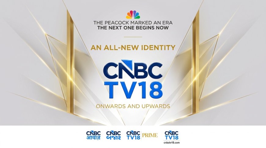
The refreshed identity rolls out across the entire CNBC cluster in India, covering CNBC-TV18, CNBC-TV18 Prime, CNBCTV18.com, CNBC-AWAAZ, and CNBC BAJAR. Full network-wide implementation goes live on March 30, 2026, bringing a unified contemporary design framework across television, digital, and connected platforms.
At the heart of the redesign is a modernised logo featuring a blue upward-pointing arrow integrated into the letter 'N' — a deliberate design choice symbolising forward momentum, growth, and progress. The familiar multi-coloured peacock, a visual staple for years, has been retired in favour of a cleaner, more minimalist aesthetic aligned with where media consumption is heading.
What This Means for Your Brand
For advertisers and media planners working with CNBC's properties, this rebrand signals something important: the network is actively future-proofing itself for a multi-platform, mobile-first audience — and that changes the conversation around media investments.
Here are three specific implications worth noting:
1. Unified Brand Equity Across Platforms With a consistent visual identity now spanning TV, digital, and connected platforms, advertisers benefit from stronger brand association recall. A viewer who encounters CNBC on CTV in the morning and CNBCTV18.com in the afternoon now experiences a seamless brand environment — something that genuinely enhances campaign effectiveness.
2. Signal to Premium Advertisers A brand refresh of this scale — especially one unveiled at a flagship leadership event like IBLA — is also a message to the advertiser community. CNBC is investing in its own brand equity, which typically correlates with renewed attention to audience quality and editorial positioning.
3. The Vernacular Play The inclusion of CNBC-AWAAZ and CNBC BAJAR under the unified identity is particularly significant. As regional-language business content consumption surges across Tier 2 and Tier 3 India, a consistent visual framework strengthens trust and recognition across diverse viewer segments — a growing priority for financial services and FMCG advertisers alike.
The contrarian view worth raising: visual rebrands, however well-executed, only hold long-term value when backed by editorial evolution. The arrow pointing upward means little if the content strategy does not follow the same direction.
The Numbers Behind the News
India's business news television segment remains fiercely competitive, with multiple players vying for the attention of an increasingly fragmented, digitally-native audience. According to industry estimates, connected TV viewership in India is growing at a double-digit rate annually, making a digital-first visual identity not just desirable but strategically essential for legacy broadcast brands.
Global precedent supports this approach. Networks that have invested in cohesive cross-platform branding — aligning their television, app, and web experiences under a single visual system — consistently report stronger audience retention and advertiser preference scores compared to those that maintain siloed identities across channels.
For CNBC India, the timing is deliberate. Launching the new identity at IBLA — a celebration of Indian business leadership — ties the brand's visual evolution to a narrative of growth and ambition. That is smart brand storytelling, not just a logo change.
The brands.in Perspective
Let's be direct: retiring the peacock is a bold call. That multi-coloured symbol carried decades of brand equity and instant recognition across living rooms and boardrooms alike. Replacing it with a minimalist arrow demands confidence — and a clear conviction that the future audience will be encountered on a screen where simplicity wins.
What CNBC India has done here is align its visual identity with the very values it reports on daily — growth, momentum, and forward-thinking leadership. The blue arrow in the 'N' is not just a design flourish; it is a positioning statement.
Whether the rebrand succeeds will ultimately depend on execution consistency across all five platforms. A great logo, poorly applied, is just a great logo. Watch this space.
Key Takeaways for Marketers
- CNBC India unveils new logo on March 14, 2026 at IBLA Mumbai
- Multi-coloured peacock replaced by minimalist blue-arrow design
- Full rollout across five platforms begins March 30, 2026
- Blue upward arrow in 'N' symbolises growth and forward momentum
- Unified identity strengthens cross-platform brand recall for advertisers
FAQ Section
Q1. What is the new CNBC India logo about? The redesigned logo replaces the traditional multi-coloured peacock with a minimalist identity featuring a blue upward-pointing arrow inside the letter 'N', symbolising growth and forward-looking progress across its network.
Q2. Which platforms will carry the new CNBC brand identity? The new identity covers CNBC-TV18, CNBC-TV18 Prime, CNBCTV18.com, CNBC-AWAAZ, and CNBC BAJAR — going fully live across all platforms from March 30, 2026.
Q3. Why does a media rebrand matter to advertisers and marketers? A cohesive cross-platform identity improves brand recall, strengthens audience trust, and signals the network's strategic direction — all of which directly influence media planning and advertiser confidence.
Closing CTA
Does a logo change really move the needle for a legacy media brand — or does substance always outrank style? Tell us what you think in the comments below.
Stay ahead of every major brand move in India's media and marketing world. Follow brands.in for sharp, daily brand intelligence delivered straight to your feed.
What's Your Reaction?
 Like
0
Like
0
 Dislike
0
Dislike
0
 Love
0
Love
0
 Funny
0
Funny
0
 Angry
0
Angry
0
 Sad
0
Sad
0
 Wow
0
Wow
0